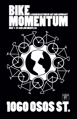
I'm doing a little online research for an upcoming bike poster design for a local winery. They will have a wine event based around a killer bicycle race in May. In the past, I've done graphics for cycling events like the Central Coast Cycling Classic, bike art posters, and Tall Bike Builds. including one for Talley Vineyards.
The stuff I come across is amazing. It's both intimidating and inspiring.
If you're not familiar with the History of bike races, a quick search will showcase some classic posters from Europe where the sport originated. There are also some contemporary bike race posters that are on our own continent that play off the history as well, and some stunning photography that captures the thrill of the race. There's some good stuff out there.
Look for mine soon...
Friday, February 18, 2011
Sunday, February 13, 2011
Prompt Attention
When you're too close to the business the obvious is not apparent. When seen from the perspective of the uninitiated, it hits yo like a ton of bricks.
Sick? Dying? FRENCH 'ER!
The subliminal suggestion displayed isn't quite what they probably had in mind. Spotted on a billboard on the 101 southbound just north of SLO. I definitely did a double take when I went whizzing by. French is a Hospital located in San Luis Obispo. At 65 mph, no one will pick up on the light serif font that spells it out. On the positive note, I did read it all the second time I drove south to SLO. I'm assuming the intended audience is the local traffic that commutes to work every day.
On the campaign expense side, I see the ad on billboards both northbound and southbound, AND in the local newspaper AND the cash paid to the ad agency who owns the account. Was it intentional? If so - Brilliant! The client has a great sense of humor, and the agency has a sharp designer who knows how turn heads (not recommended on the freeway while driving). So I ask you marketeers out there: Should the client drop the agency? What amends should take place?
On the campaign expense side, I see the ad on billboards both northbound and southbound, AND in the local newspaper AND the cash paid to the ad agency who owns the account. Was it intentional? If so - Brilliant! The client has a great sense of humor, and the agency has a sharp designer who knows how turn heads (not recommended on the freeway while driving). So I ask you marketeers out there: Should the client drop the agency? What amends should take place?
Sunday, December 5, 2010
Banzai Pipeline
This place steeped in surf history will always be the theater for young guns, aspiring to get their moment. This vid clip shows the lineup as it is without any particular pro featured. You see just how tight the pack can be, and how competitive the lineup is. Shot from the beach it does not even touch on the chatter competition and pecking order going on in the water. This year's Pipe Masters will be dedicated to Andy Irons.
Surfing @ Pipeline from kini on Vimeo.
Surfing @ Pipeline from kini on Vimeo.
Wednesday, October 20, 2010
Public Art the way it should be:
Street Sign Sculpture from Six Stair on Vimeo.
Street sculptor shows us all how it should be done; unexpected, revealing, speaks to your soul. Street art is a a shared moment between artist, observer and their surroundings. Awesome job!Wednesday, October 13, 2010
CCCMB TrailWerks Poster
When I was assigned this job, and CCCMB told me the trailwork targeted, I immediately thought of American Gothic by artist Grant Wood as the hook. This may be the most parodied art by an American painter.
I replaced the original house with Froom Ranch house, strapped a BMX helmet that fit the farmer's skull so well, traded the pitchfork for a McCloud, and gave the wife a shade hat worn by sun savvy hikers. This classic painting is a cultural icon and has been one of the most reproduced – and parodied – images ever.
I hope this poster catches the community's attention and brings many volunteers out on this special TrailWerks day. WHAT HAVE YOU DONE FOR YOUR COMMUNITY LATELY?
Monday, October 11, 2010
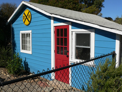
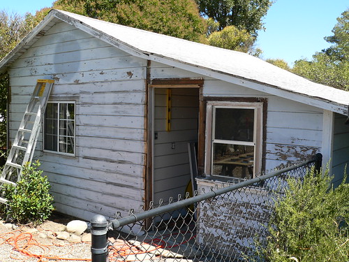
On-Track Studio Curb appeal
Well it's amazing what a pallette of colors can inspire...
 |
| The palette that initiated the makeover. |
I have worked in this studio for the past two years neglecting the exterior until this summer. It's always been a non-descriptive shed with little (ok, none) curb appeal. The interior is sheetrocked, insulated, painted and can be quite cozy when the weather is acts up. When inspired, the work flows and the imagination is triggered. Though I wish the creative spark does not make the work any easier (sigh).

More photos on my Flickr Site
Subscribe to:
Posts (Atom)


